9 Must-Have Features for a Fabulous Scuba Diving Center Website

If you’re running a scuba diving center, your website is more than just your online business card (or at least it should be). Your website should be driving new customers your shop more than through any other source. If it isn't, then it may be time to ask yourself why that is. Here are nine must-have features to help you reel in the divers and make a splash online!
1. Eye-Catching Visuals
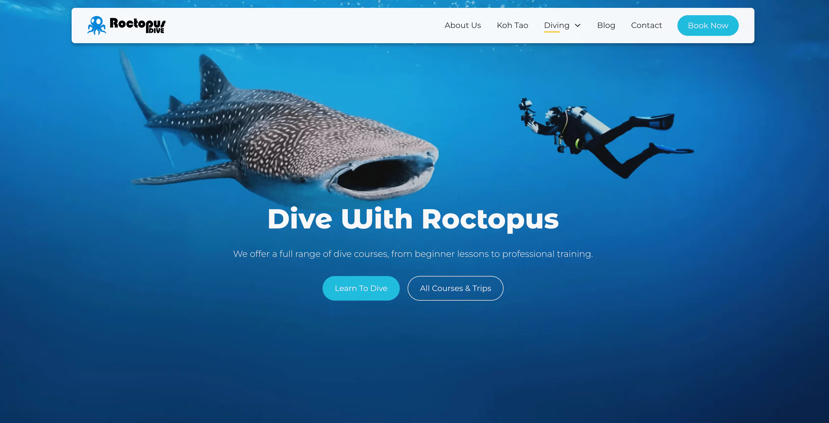
For most divers, scuba diving is all about experiencing the beauty the underwater world has to offer. Who can resist stunning underwater photos and thrilling dive videos? A website is only going to look as good as the visuals and imagery it uses. In the scuba diving industry there is no excuse to have anything but the highest quality and most beautiful imagery. Pack your site with gorgeous images and clips that showcase the colorful marine life and ecstatic divers. A site that looks good is all about giving a great first impression, and this is one of the easiest and most overlooked ways to do it.

2. Dive Deep into Details
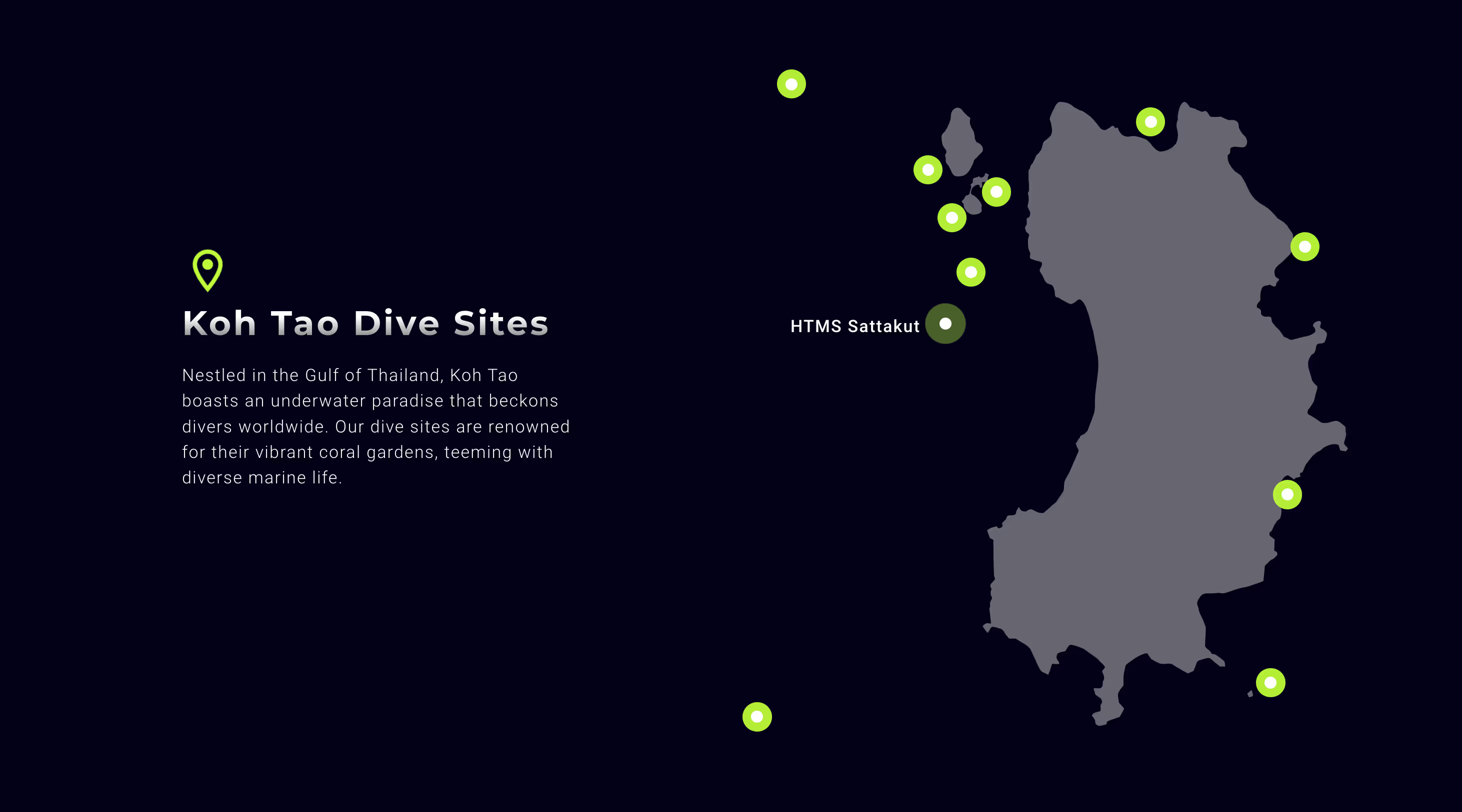
Got some awesome dive spots? Give your visitors the scoop on each one—depth, visibility, currents, and the cool critters they might meet there. This helps experienced divers pick the perfect site and gather the information that matters to them. It also allows novice divers to feel at ease learning about the site conditions ahead of time. Check out how Turtle Divers display the dive sites they frequent on Koh Tao with a beautiful interactive map.

A good collection of dive site information also allows your website to become the go to resource for divers in a region, increasing organic traffic to your shop's website and driving the perception of your shop as experts in the region.
3. Clear Pricing and Attractive Packages
No one likes hidden costs, right? Be upfront with your pricing and lay out the details of different dive packages. Whether it’s a kids bubble-maker session or a deep dive for the pros, clear info helps your guests dive into booking without having to jump through hurdles to find the information they are looking for before committing. The fewer roadblocks your site has to booking compared to a competitor, the better!
4. Show Off Your Team
Meet the crew who makes all your underwater adventures possible! Your website should have a dedicated section to introduce your staff. Include fun, professional photos and short bios for each team member, highlighting their certifications, diving experiences, and a little personal touch—maybe their favourite dive sites or a fun fact. This not only personalizes your website but also builds trust. Divers love to know who will be guiding their journey and teaching their courses, so showing off your enthusiastic and skilled team can really make your site—and your diving center—stand out from the crowd!
.avif)
5. Book with a Click
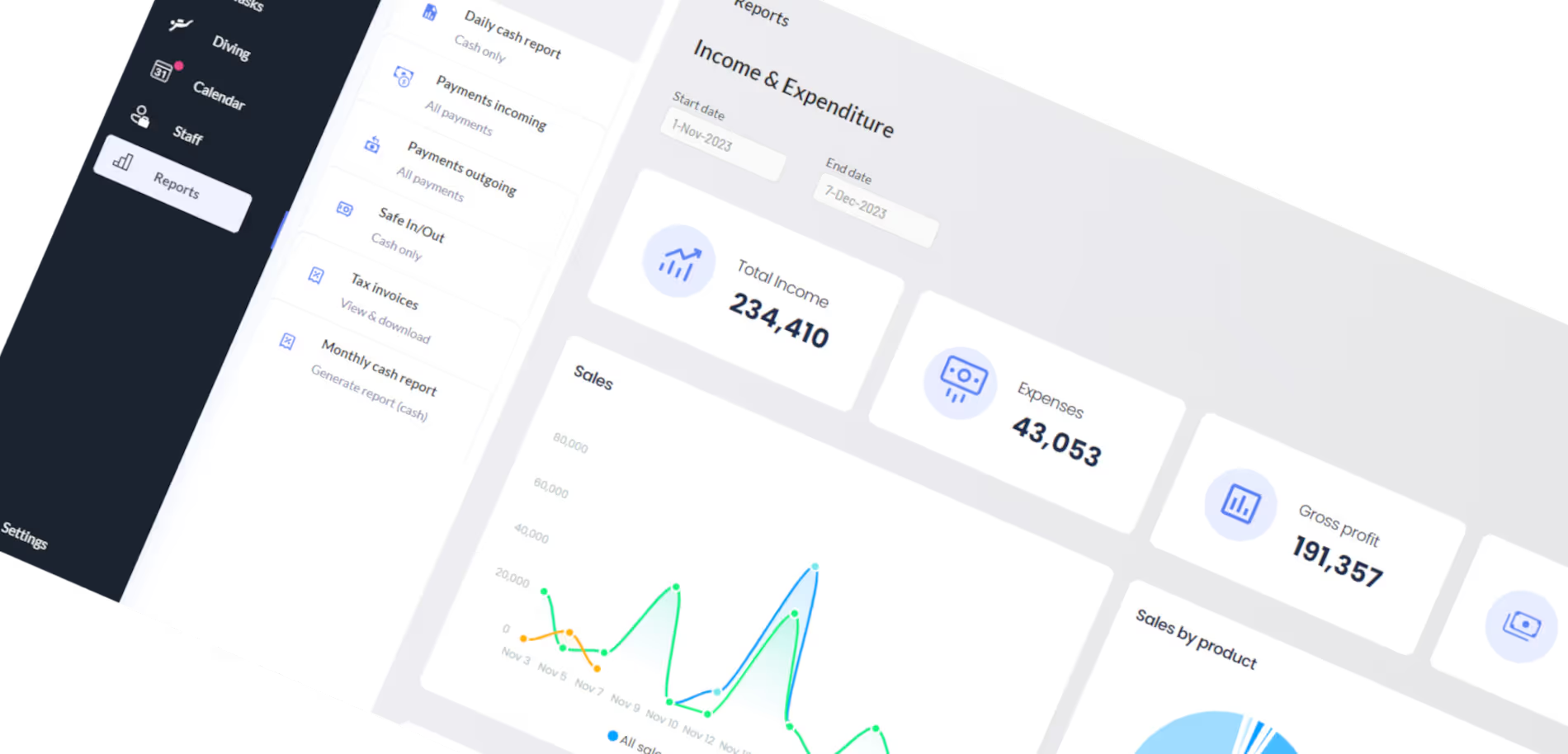
Make booking a breeze with an easy online booking system. Once again, the fewer hoops visitors have to jump through before giving you their business, the better! Your courses and packages should include a way to book and pay for their course online. For a seamless experience, consider using DiverDash, an excellent tool tailored for dive shop management from course booking and scheduling to inventory and equipment tracking.

6. Speedy Site Surfing
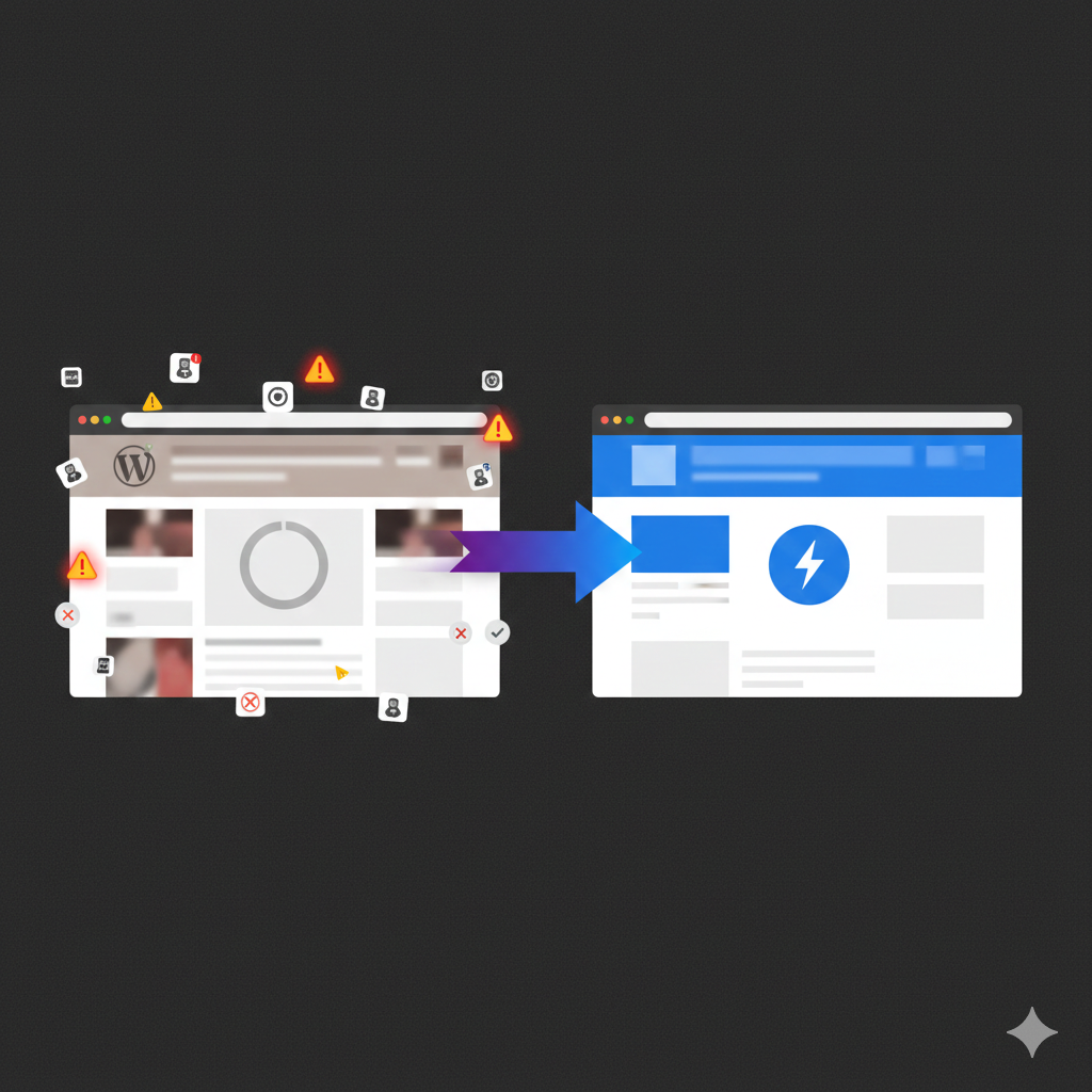
Nothing tests patience like a slow-loading website! Keep your website zippy to hold your visitors’ attention and improve their experience. You can check your site’s speed using tools like Google's PageSpeed Insights. This tool not only tells you your speed but also suggests actionable steps you can take to improve the performance of the site. Think about it, if someone is shopping around for their next dive trip, the website that is least frustrating to use is most likely going to be the one that stands out from the crowd.
7. Safety First, Fun Always
Highlight how you keep divers safe and sound. Outline your safety protocols, emergency actions, and how you keep your gear tip-top. Sprinkle in glowing reviews from past divers to show newbies they’re in good hands. This isn't just about giving new students the peace of mind that they will be looked after. Experienced divers know what to look for in a dive shop. If your shop takes the time to explain how you look after the safety of your divers and the quality of your gear, it tells visitors what your shop prioritises and values.
8. Answer their Questions
Every diver, from novices to pros, has questions, and your FAQ section is the perfect place to address them head-on. This part of your website should be easy to find and navigate. Include answers to common questions about your diving services, safety protocols, equipment rental policies, and anything else your customers frequently inquire about. Be sure to update it regularly as new questions arise or as your services evolve. A thorough FAQ section can significantly reduce the time your staff spends on the phone answering basic questions, allowing them more time to focus on providing top-notch service. Plus, it reassures your divers that you're transparent about your operations, which enhances trust and reliability.
.avif)
9. Stay Connected
Make it easy to reach out and ask more questions. Display your contact info clearly and make it easy for users to reach out with a contact form (or if you're feeling really fancy, a live chat) and connect your social media to keep the conversation going there and let users see a more personal side of your shop. It’s a great way to show off the fun and community in your dives! Make sure to include vital information like certification level or number of dives in your contact form so that your staff can more accurately answer questions they receive.
Let's Build Something Outstanding Together
.webp)
.webp)
.webp)
.webp)
.webp)
.webp)
.webp)


.webp)


